OPAP is the leading gaming company in Greece with a turnover of over €4 billion and one of the biggest listed gambling companies in Europe. During the height of the COVID-19 pandemic they were forced to close their retail stores - their main source of revenue - and move all business online.
As a result they approached ELSE with the challenge of improving the customer experience and functionality of their online gaming platform.
My role
UI designer
Sector
Entertainment, Gaming
Discovery
To understand as much as possible about the OPAP brand and the challenges they faced within a short space of time, the team immersed ourselves in their world through a range of activities such as stakeholder interviews, product walkthroughs, sector and lateral research etc.
Due to my specific role on this project as a UI designer, during this phase of work I participated mostly in activities that would help shape the design language and future brand direction of OPAP’s digital estate. For example, I helped set up and run a brand personality workshop with key client stakeholders in Miro.
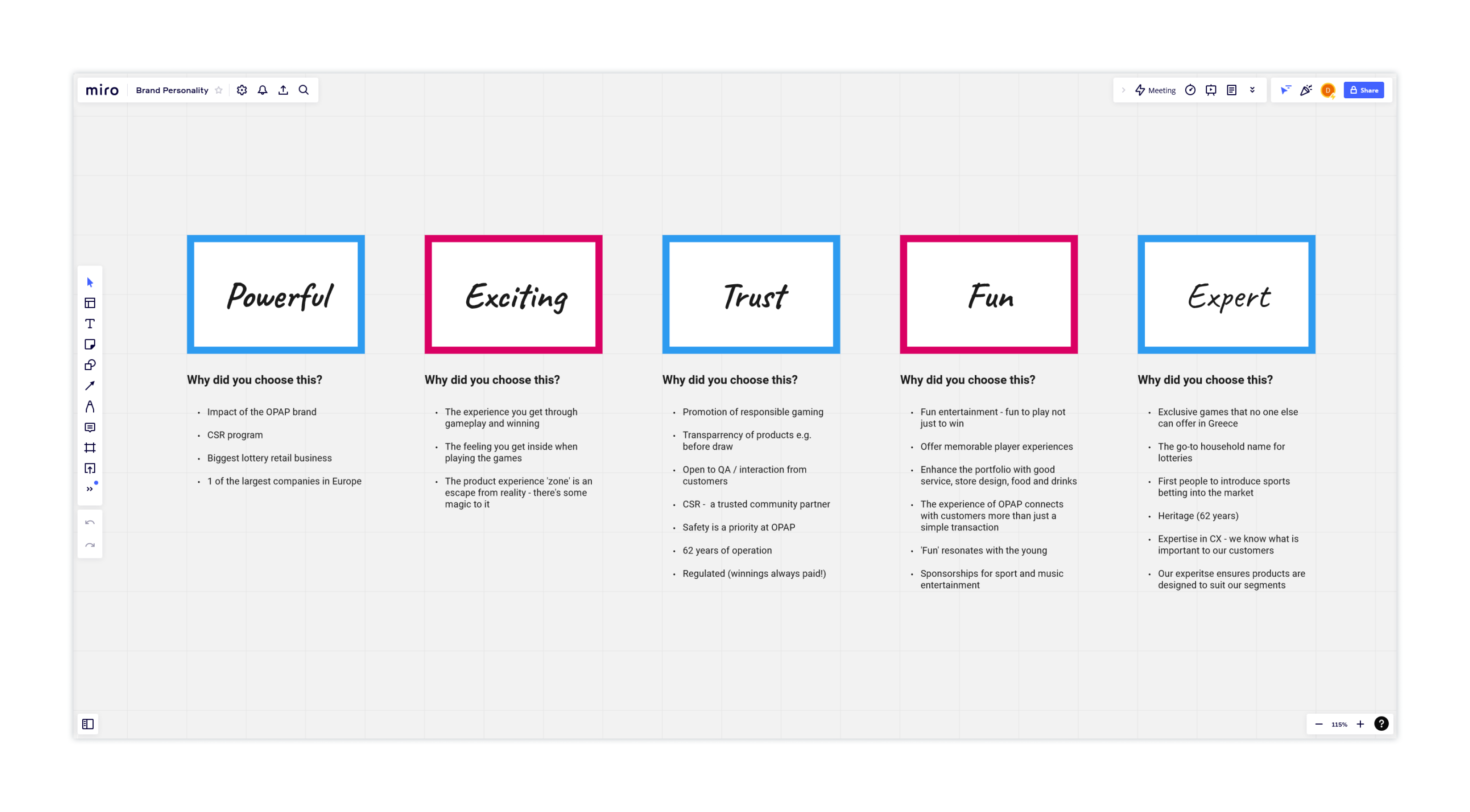
The 5 character defining words we arrived at for the OPAP brand
We started with a grid of 28 words and had the participants work together to select the 5 they felt best communicated the character of the OPAP brand. Whilst they worked together we prompted them to generate discussion and dive deeper into why different participants were advocating for some words and not others.
This was incredibly valuable because, as well as reaching a consensus from various client stakeholders for what characteristics we should use to guide the design language of OPAP’s future online presence, we crucially learnt why communicating them provided value for the business and in turn the customer experience.
Setting the strategy
Following the discovery process, the strategy team synthesised all our findings into a clear direction focused on evolving the OPAP brand and online platform to effectively tackle users largest pain points and increase customer satisfaction.
For example, one of OPAPs biggest strengths, their huge library of exclusive and non-exclusive games, had created inconsistencies in the play, checkout and account experiences for customers interacting with OPAP across different products.
Therefore at the core of this new strategy was moving from a fragmented experience to a unified entertainment experience. Wherever and however you play it should feel like one experience, unified and greater than the inidividual elements, creating an environment that is entertaining in and of itself, not just within each game.
Experience principles
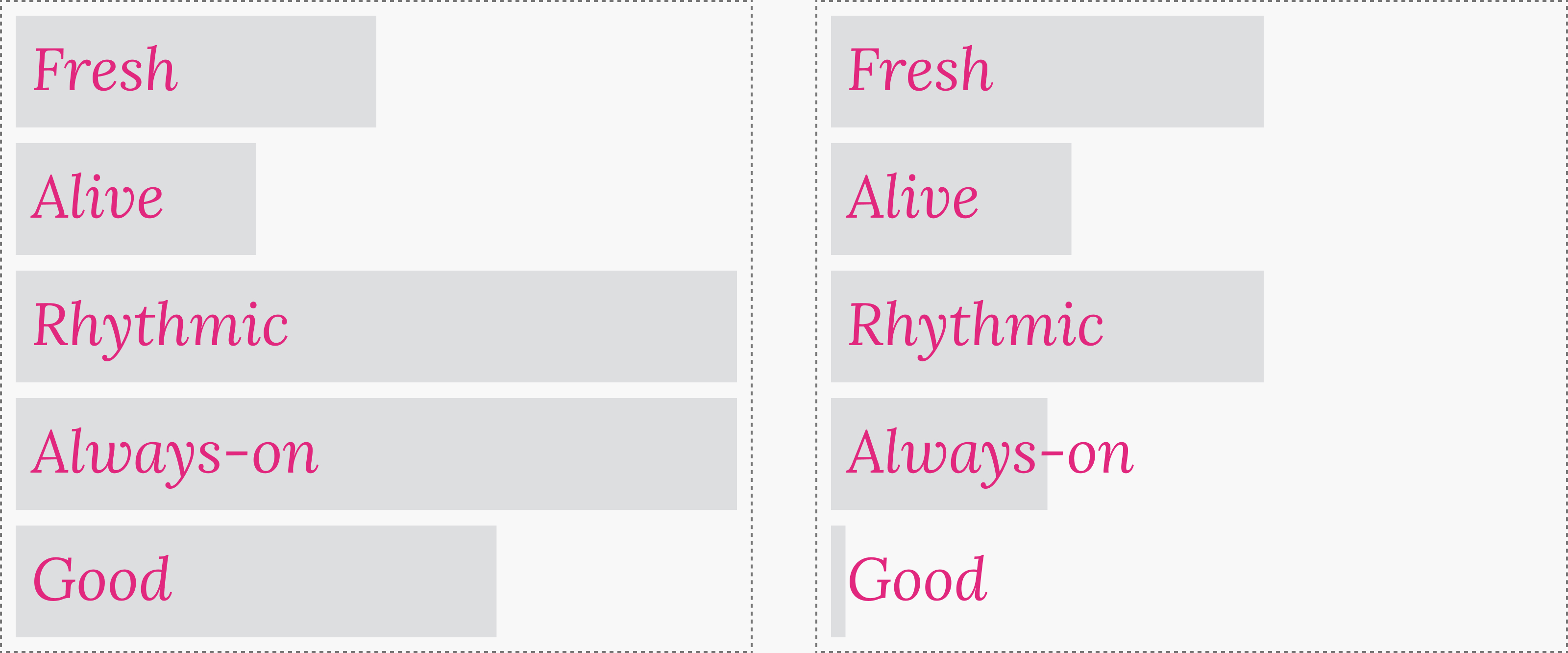
To help us to build an experience that successfully delivers this strategy, the team set the following guiding principles for us to refer to throughout the design process:
Fresh
An experience that appeals to young and new players – not only the ‘hardcore’
Alive
Delivering excitement when playing anywhere through live data-driven experiences
Rhythmic
Bringing to life the natural rhythm of gameplay online – weekly, daily, hourlys
Always-on
A place where you want to spend time, whenever or wherever you want
Good
Highlighting the good we do, which in turn is the good you've helped us create
Experience principles applied to homepage vs online gameplay
It’s important to note that these principles are not applied consistenly across the OPAP experience. Instead, the amplification of each principle adjusts to match the experience we want to provide the customer at any given moment.
Design routes
With the strategy and experience principles in place, we set to work exploring what kinds of visual language could appropriately communicate the new vision for a unified entertainment experience.
The design director and I crafted two distinct design directions. We each originated a direction of our own and then worked together in the later stages of the process to refine and complete the stylescapes.
One of the challenges with lottery design projects is that each game has to feel both distinct and cohesive with the overall experience of the parent company.
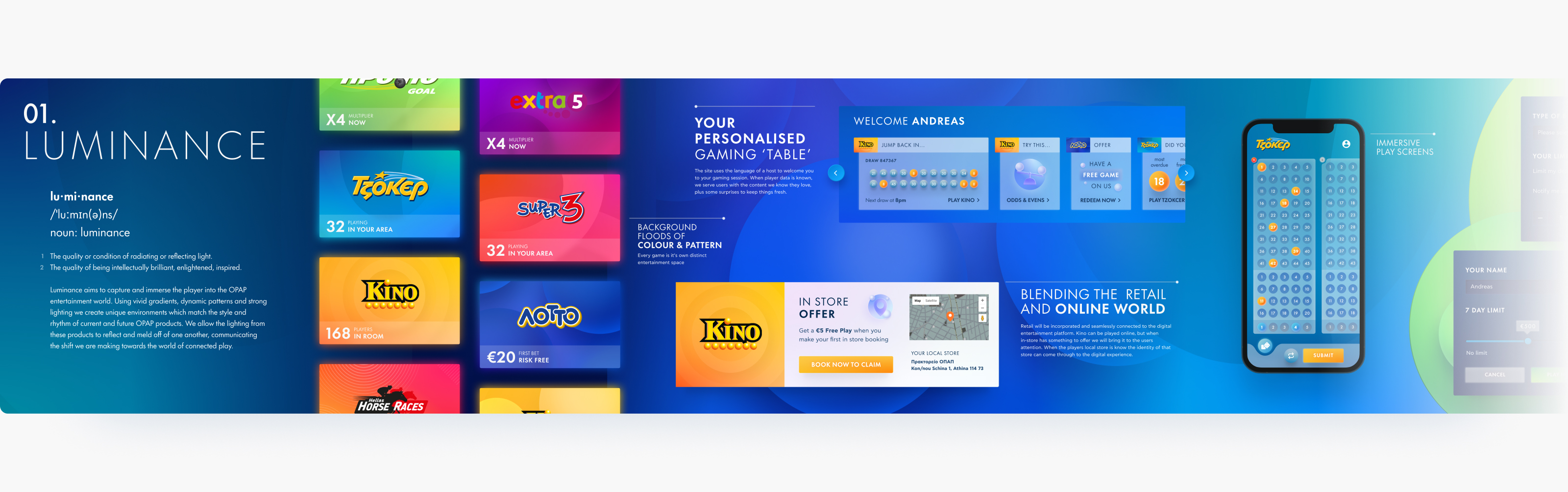
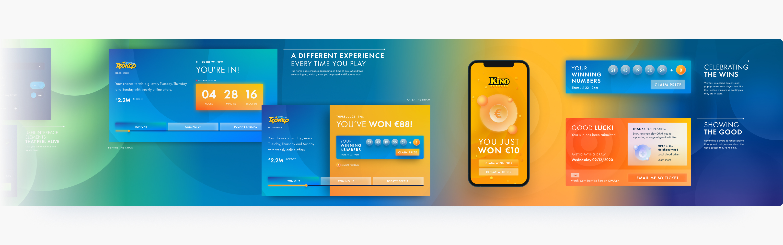
Luminance, originated by myself, immserses the player into the OPAP entertainment world. It features strong gradients, glows and patterns to create unique environments for each game. The lighting from each product is allowed to reflect and meld off one another, creating the sense of a unified entertainment experience.
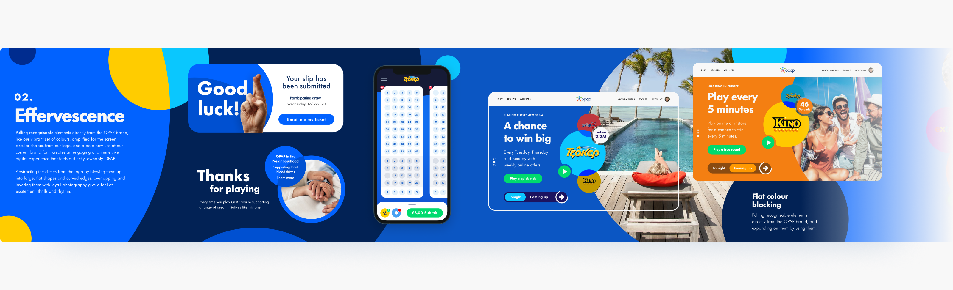
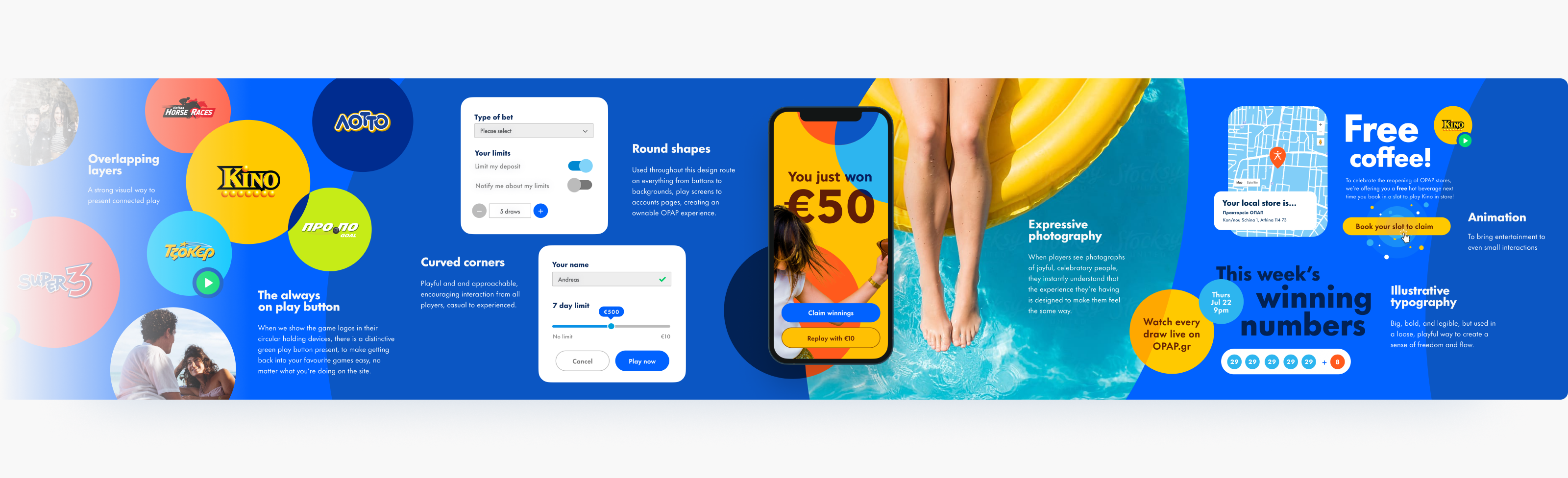
Effervescence pulls recognisable elements directly from the OPAP brand and amplifies them, along with joyful photography, to create a feeling of thrill and excitement. Abstracting the circles from the logo and blowing them up into large overlapping shapes shows our movement towards a unified experience.
Chosen route
After presenting both routes to the client, they asked if we could combine the gradients, patterns and lighting from Luminance with the photography and typography from Effervesence - a request we were happy to accomodate!
THE NEW PLATFORM
A unified entertainment experience
Gameplay experience
Our goal for the gameplay pages was to create a streamlined experience that allowed the users to focus on playing the game without distraction.
To achieve this, we use our bright gradients to draw attention to the interactive areas of the game whilst using a dark tone to push the rest of the page out of focus.
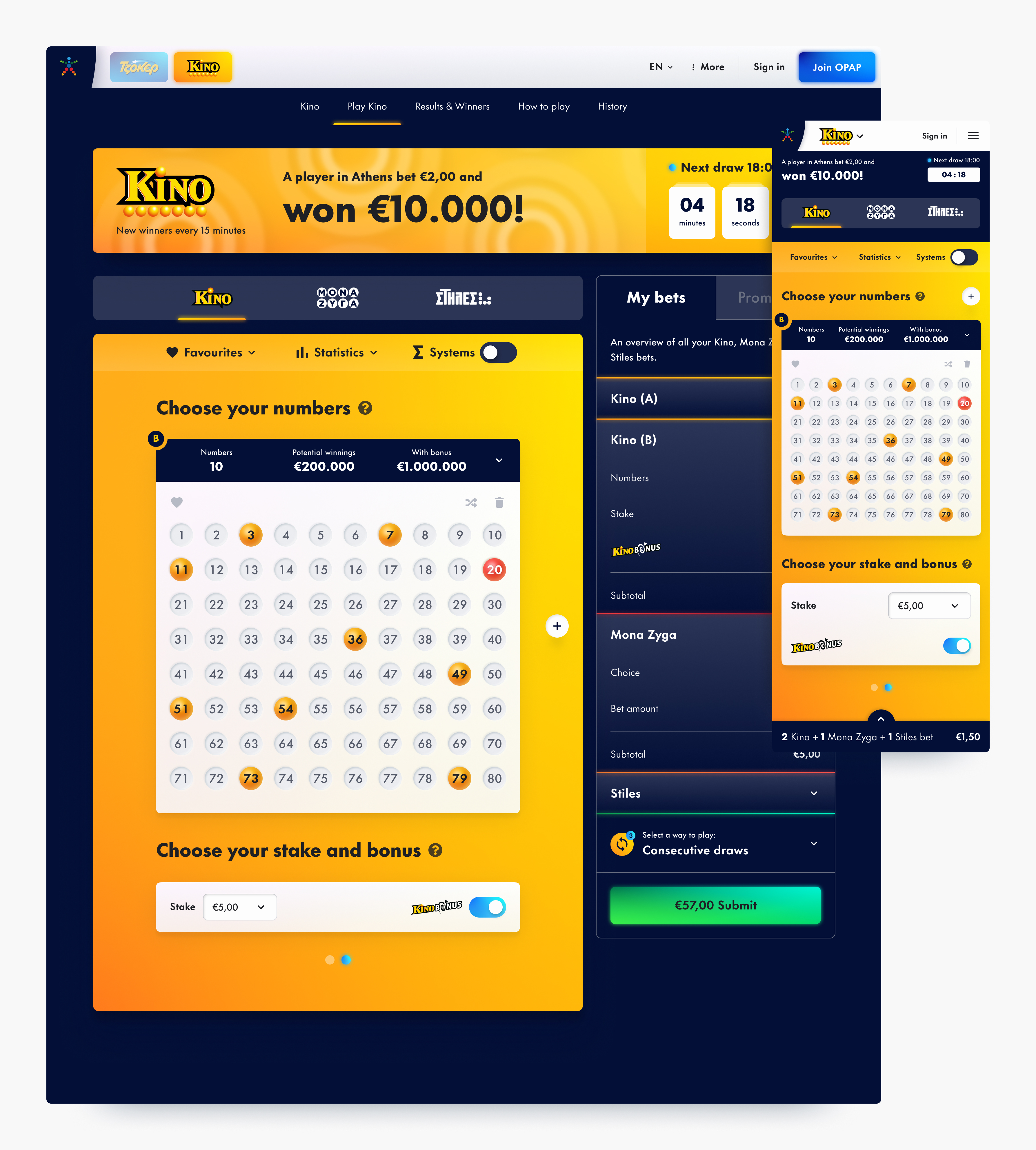
For all games we retain the form and layout of the physical play slips so the gameplay experience is familiar and consistent no matter where you play.
All gameplay pages use a 2 column template with a persistent betslip to help players track and submit their bets easily no matter which game they are playing.
Landing pages
We use full bleed components to create an immersive experience for players as they keep up to date with their favourite games on our landing pages.
The ‘recent games’ and ‘fun ways to play’ modules provide quick and entertaining ways to get players back to the gameplay experience.
The banner area, found above the footer in this case, can be used to promote other OPAP products, initiatives and important information.
Social responsibility
In line with our fifth principle, this page highlights all the good OPAP have been able to do for the community thanks to the help of the players.
Being a content hub, it was especially important to ensure the components on this page were flexible enough to house various type of content in different ways so OPAP could tell any story they needed to, both now and in the future.
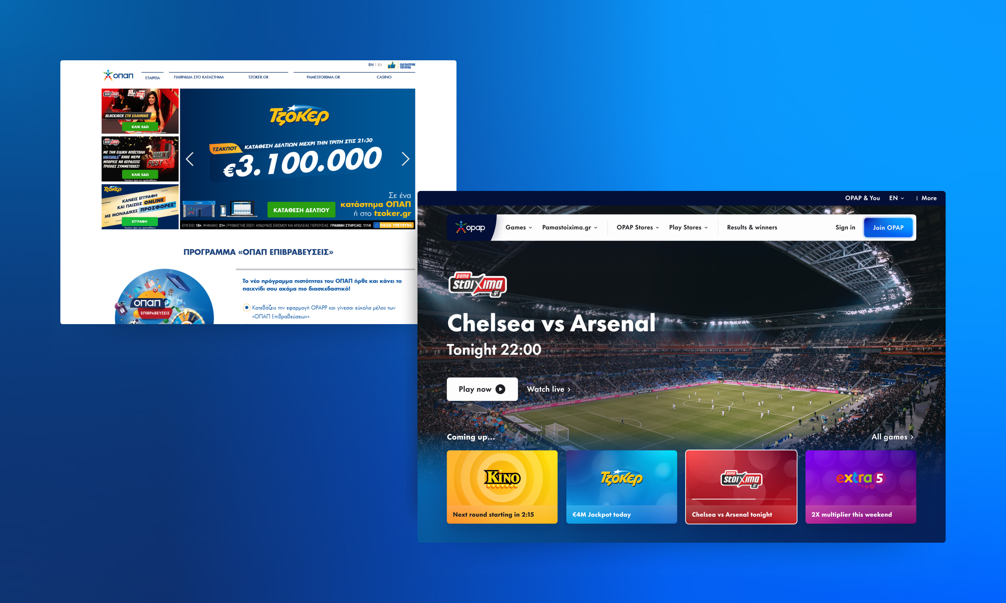
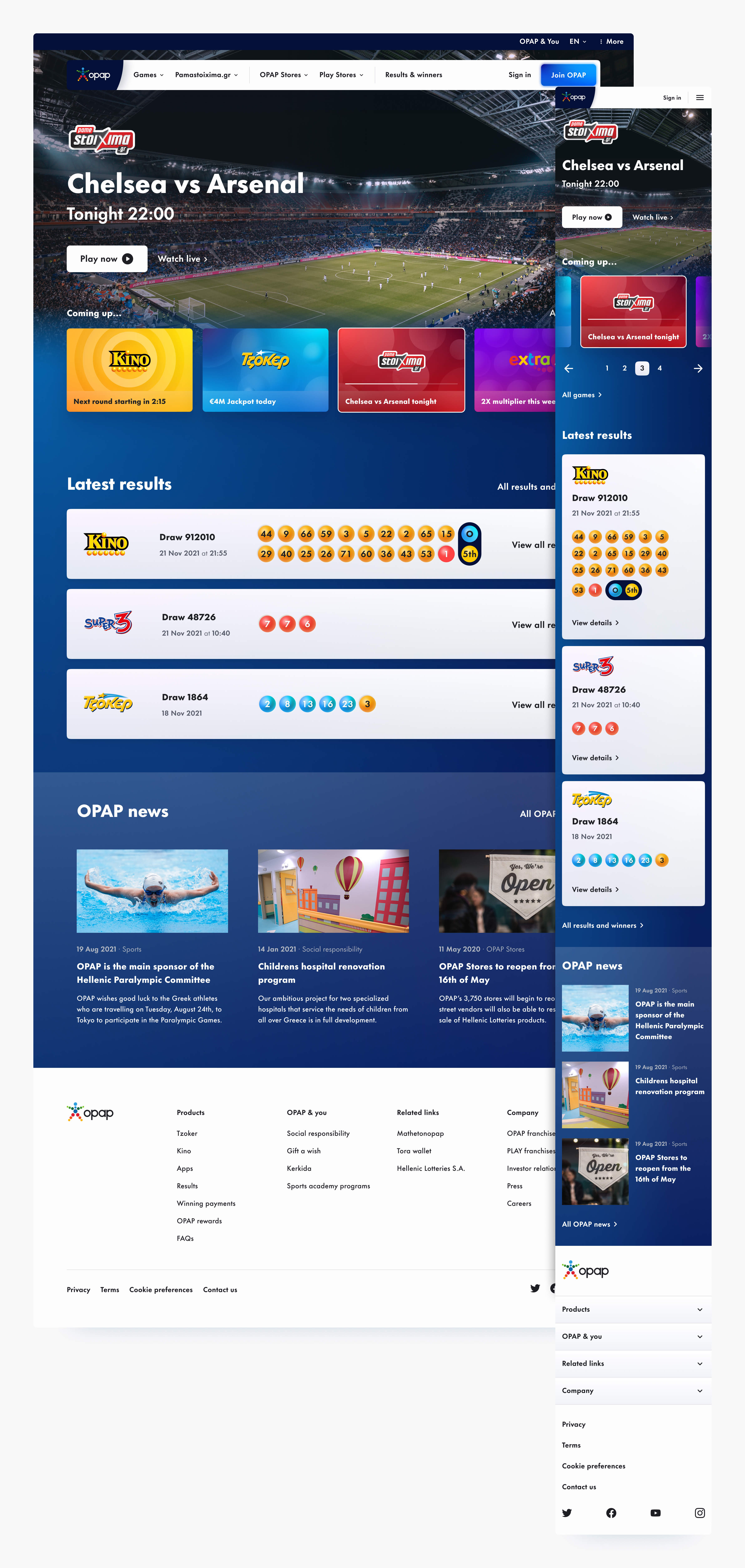
Homepage
Much like game studios such as Blizzard, what people love most about OPAP are the games and the entertainment they provide.
So for the hero, we took inspiration from TV guides and how they communicate the upcoming entertainment for the week and applied it to the OPAP gaming world.
Can digital design classics exist?
Is there such a thing a that we can aspire towards creating?
© DAVID FRIEDMANN 2022
© DAVID FRIEDMANN 2022
© DAVID FRIEDMANN 2022
© DAVID FRIEDMANN 2022
© DAVID FRIEDMANN 2022